Creatine gummies

A packaging design for creatine gummies formulated for women, combining fitness-focused positioning with a refined luxury aesthetic. The system explores two complementary directions, blending bold modern typography with elegant color palettes and fluid, organic pattern work to communicate both performance and wellness.


Role

Print

Services

Packaging design

Challenges & Objectives

/ Challenges

The main challenge was balancing a health and fitness product category with a premium, feminine visual identity. It required avoiding overly clinical or overly cosmetic clichés, while ensuring the packaging still clearly communicates strength, energy, and performance. Another key challenge was maintaining cohesion between two distinct color directions while preserving a unified brand feel.

/ Objectives

To create a packaging system that elevates a functional fitness supplement into a premium lifestyle product. The goal was to design a feminine yet powerful visual identity that merges health, performance, and luxury through expressive typography, refined color palettes, and fluid motion-inspired pattern design.

Creatine gummies packaging design for women
Creatine gummies packaging design
Creatine gummies packaging pattern
Creatine gummies packaging pattern2

Creative
Process

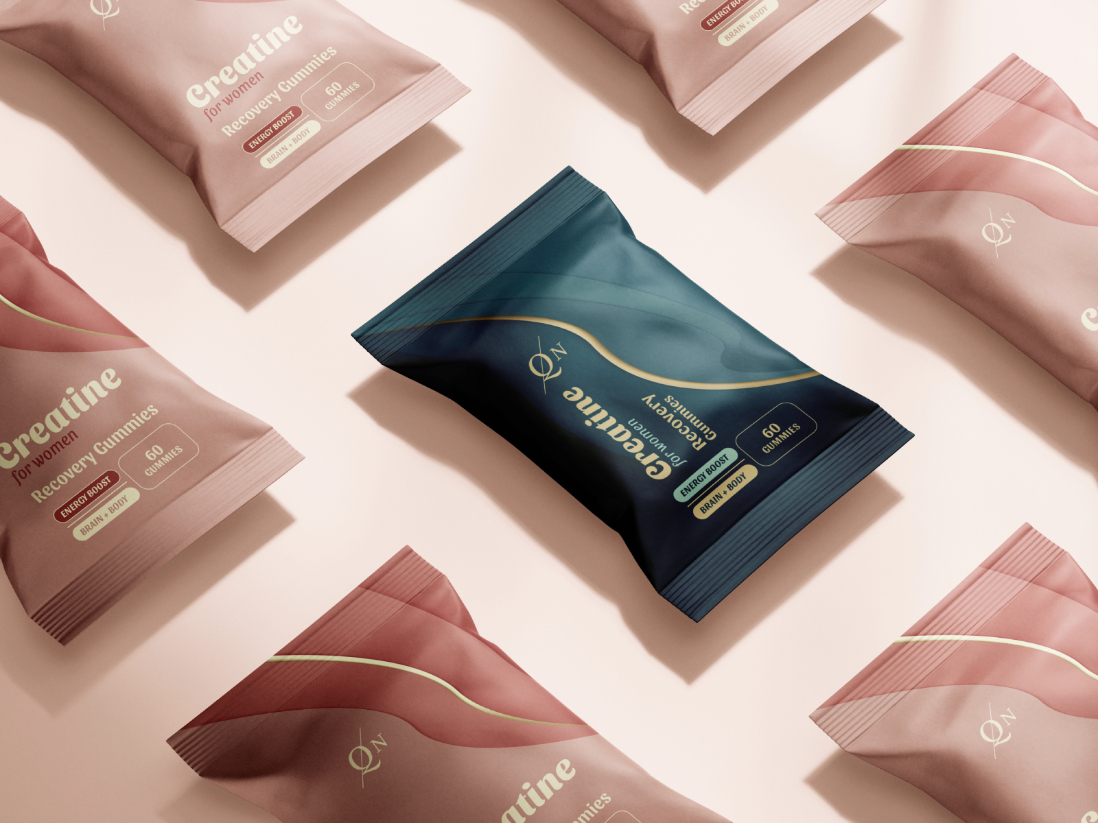
The process began by defining a dual-direction visual system. The first direction focused on soft rose pink tones paired with fluid, motion-inspired patterns to express femininity and energy, while the second explored a deeper turquoise-green palette to communicate strength, focus, and vitality. Bold gold typography was introduced as a unifying element across both variations, ensuring consistency and premium appeal. The patterns were developed with soft, flowing forms to suggest movement and internal energy, reinforcing the product’s performance benefits.