A series of fall-themed poster designs created for seasonal cultural events such as October festivals and Halloween exhibitions. The visual system combines expressive typographic layouts with Bauhaus-inspired geometric patterns, enriched with subtle autumnal motifs including stylized leaf forms, resulting in a refined, gallery-style interpretation of the fall season.
Role
Print and web
Services
Pattern Illustration
The main challenge was translating a seasonal theme into a sophisticated, non-literal visual language that avoids clichés or overly decorative “Halloween” aesthetics. It required balancing bold, structured Bauhaus geometry with warmth and organic autumn references, while ensuring typography remained the primary communication tool within each poster composition.
To design a cohesive poster series that captures the atmosphere of autumn events through a refined Bauhaus-inspired approach. The goal was to combine minimal typography with geometric pattern systems and restrained seasonal symbolism, creating visually engaging yet mature and gallery-appropriate designs.
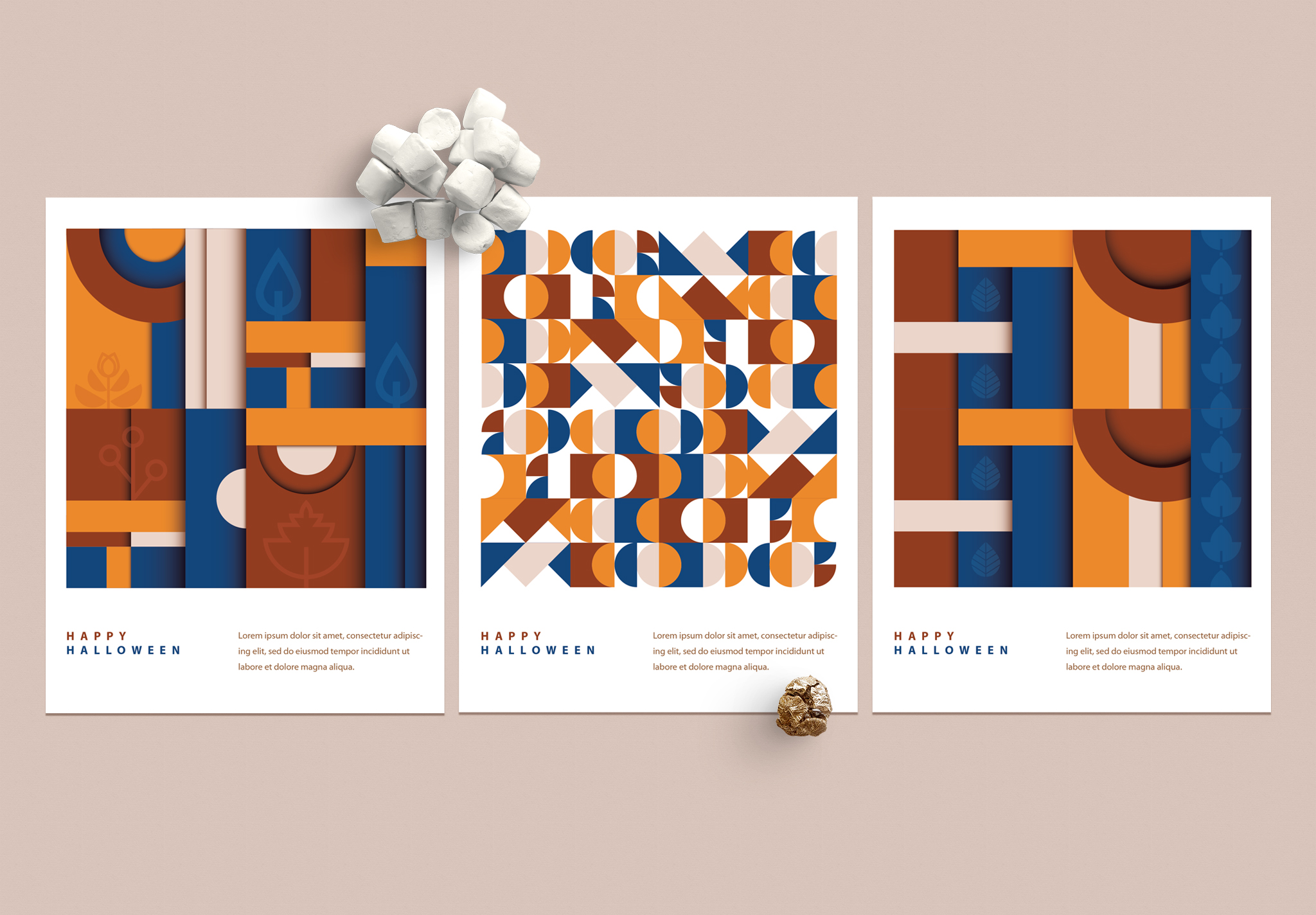
The process began with exploring Bauhaus-inspired composition principles, focusing on hierarchy, grid structures, and the relationship between typography and geometric form. Early ideas investigated how minimal use of typography could carry the message while patterns and shapes acted as main visual rhythm.
Autumnal themes were then abstracted into simplified leaf geometries and integrated into repeatable pattern systems, ensuring they remained subtle and consistent with the Bauhaus language. The color palette was carefully tested across multiple compositions to balance warmth and contrast without losing clarity.
Final compositions were refined by tightening spacing, reinforcing typographic hierarchy, and ensuring each poster could stand independently while still belonging to a cohesive seasonal series.