Premium seafood branding and packaging

(Description)

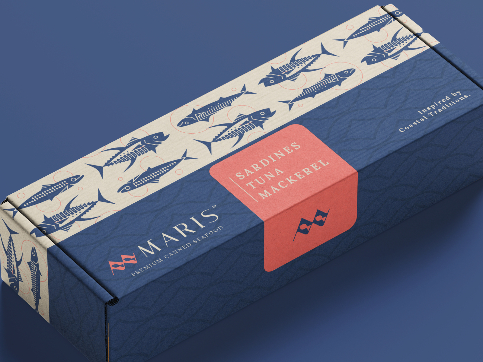
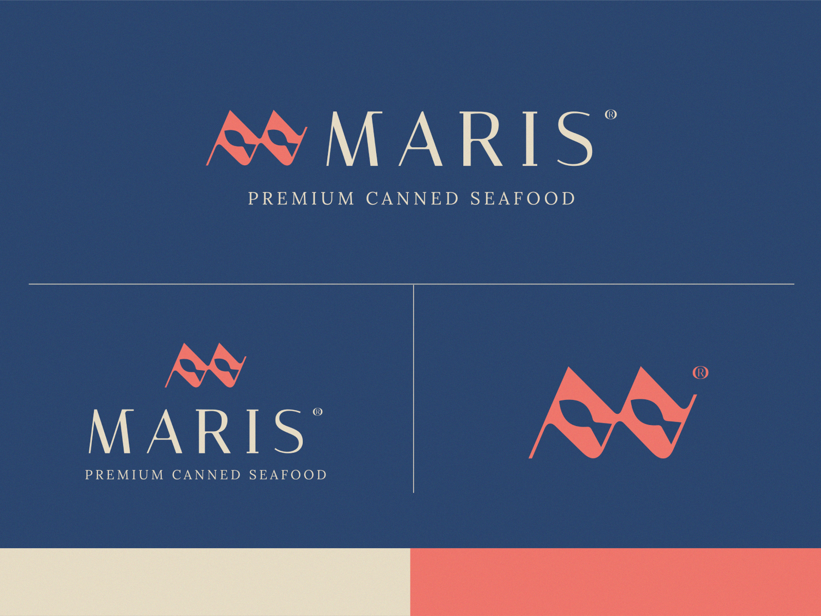
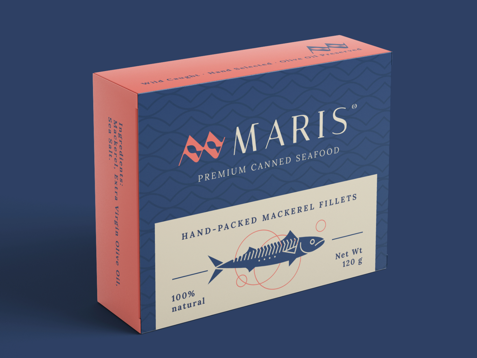
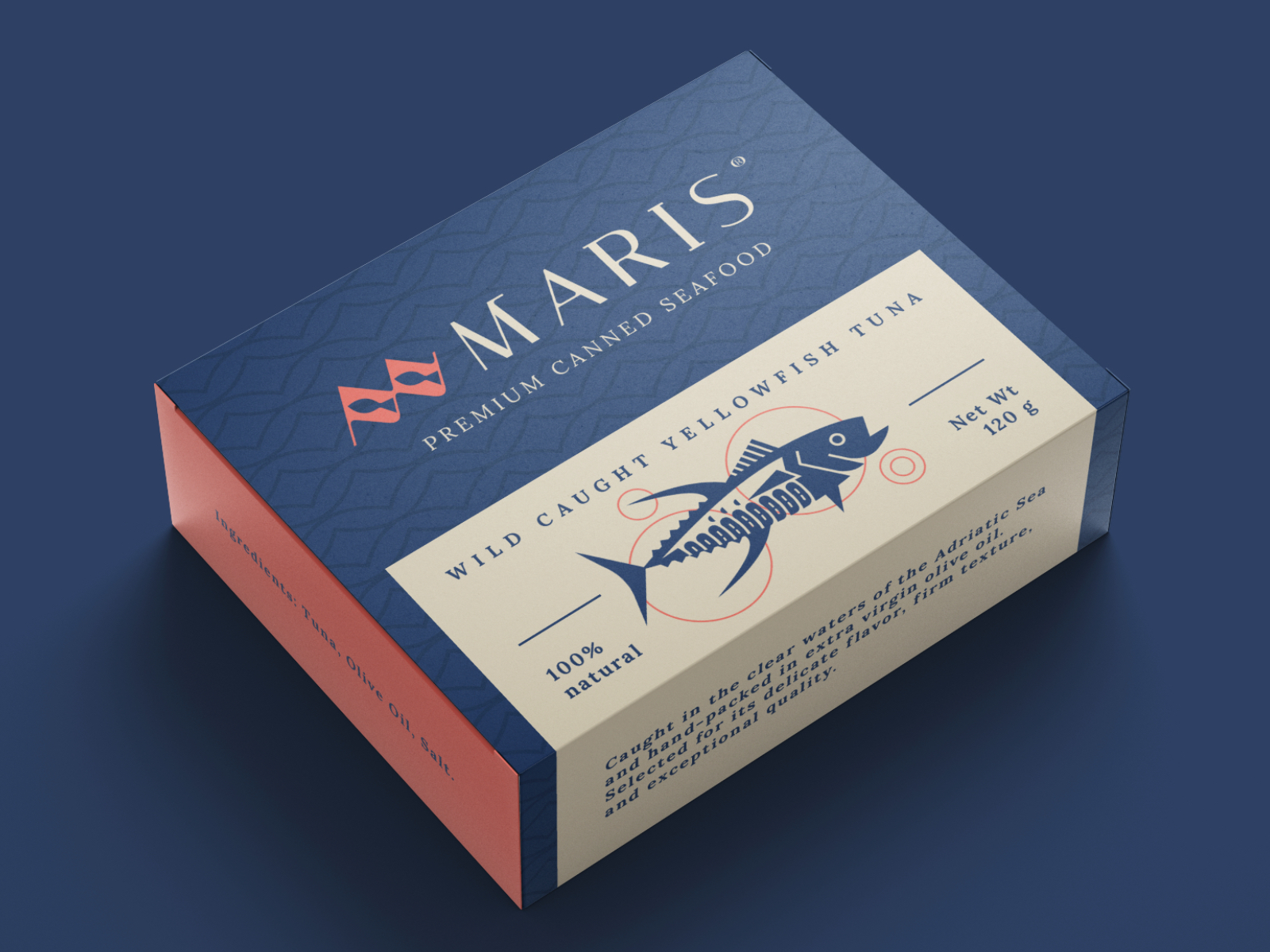
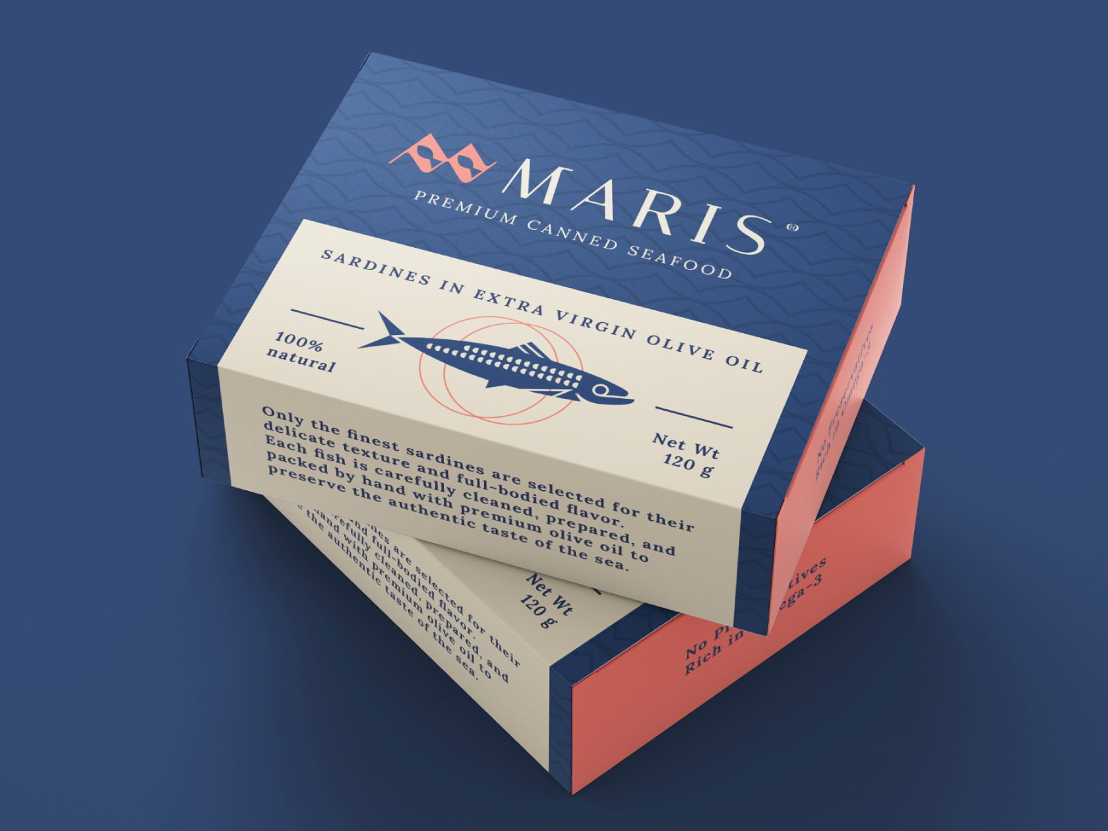
Maris is a conceptual premium canned seafood brand built around the idea that simplicity communicates quality. The identity combines clean, contemporary design with modern geometric illustrations to create packaging that feels refined, confident, and timeless. A restrained color palette of deep navy blue and coral red reinforces the premium positioning while providing strong shelf presence across the product range.


Challenges
& Objectives

/ Challenges

The canned seafood market is saturated with visually busy packaging that often relies on traditional maritime imagery and inconsistent branding. The challenge was to develop a minimal, premium identity that would stand apart from competitors while maintaining instant product recognition. The design needed to communicate quality through restraint, using illustration, typography, and color to create a sophisticated yet approachable brand.

/ Objectives

  • Create a distinctive premium identity with a clean, minimalist aesthetic.
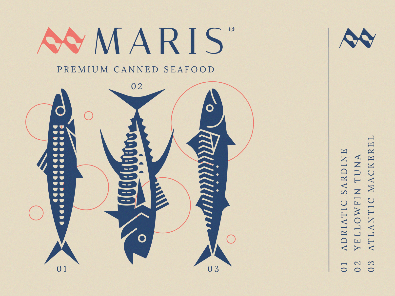
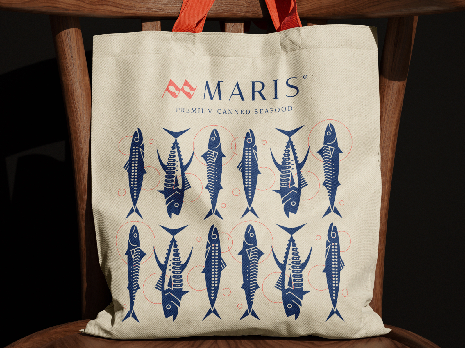
  • Design a family of modern geometric fish illustrations that become the brand’s defining visual element.
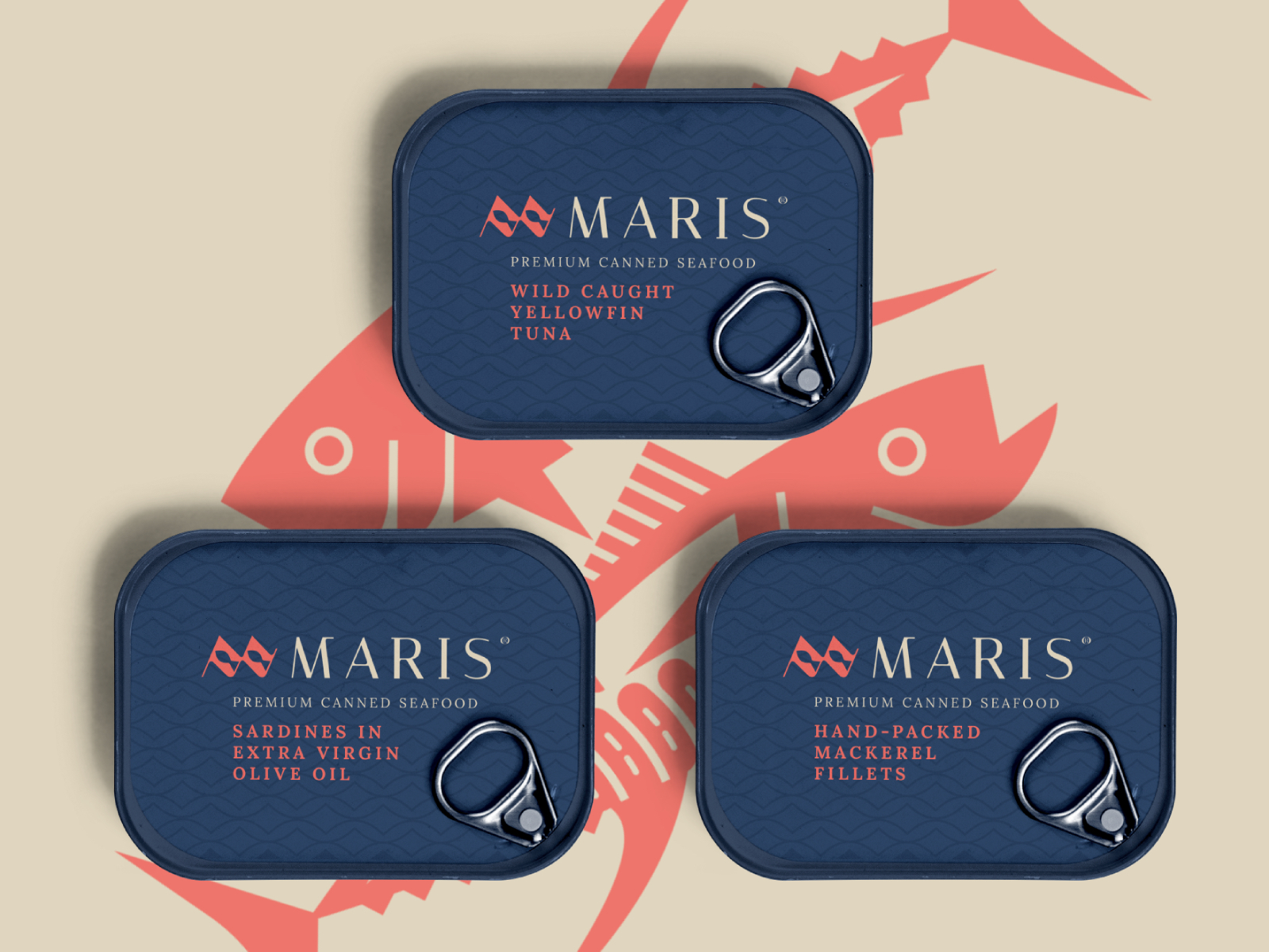
  • Establish a cohesive visual system using a limited palette of navy blue and coral red.
  • Balance simplicity with strong shelf visibility and product differentiation.
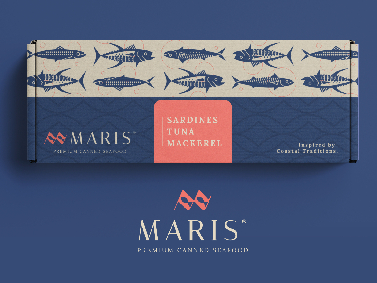
  • Develop branding that extends consistently across packaging, merchandise, and shipping materials.

/ Final Outcome

The result is a refined and contemporary seafood brand that reimagines traditional canned fish packaging through modern design principles. Minimal typography, geometric illustrations, and a bold color palette work together to create a distinctive visual identity that feels both premium and memorable. The flexible branding system scales effortlessly across multiple product varieties and brand applications, delivering a cohesive experience that reflects craftsmanship, quality, and modern elegance.