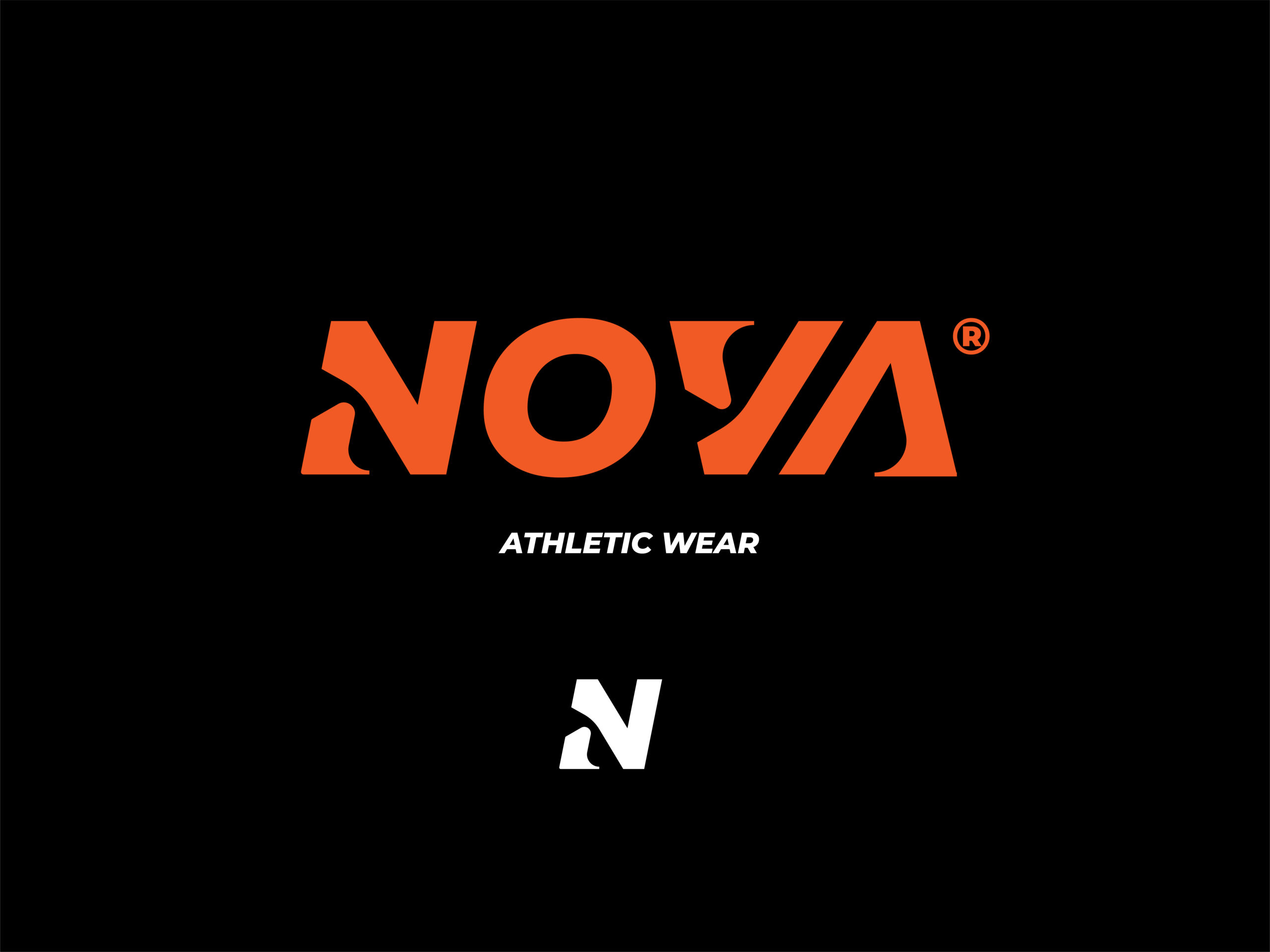
Athletic wear brand logo design

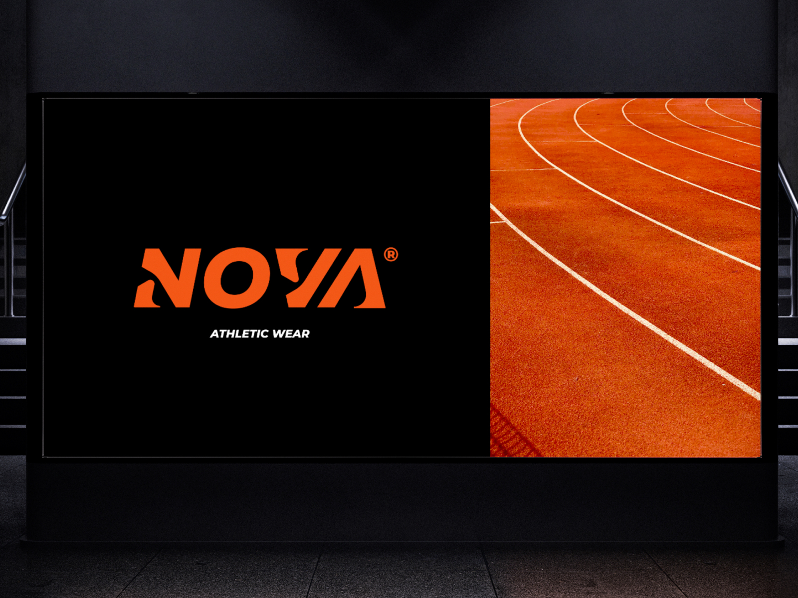
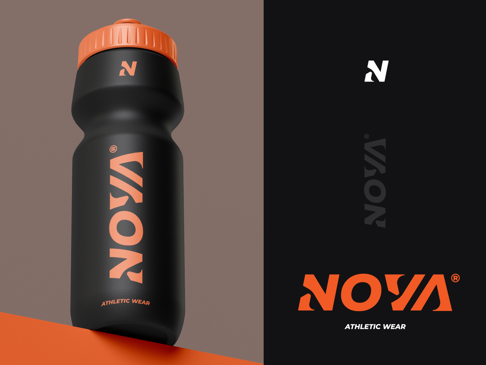
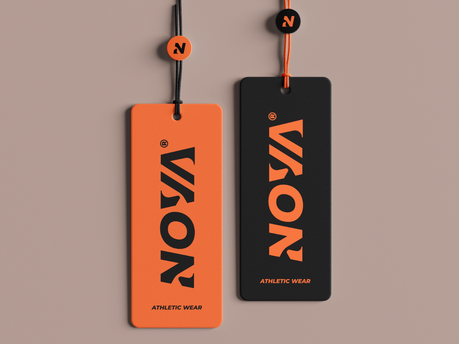
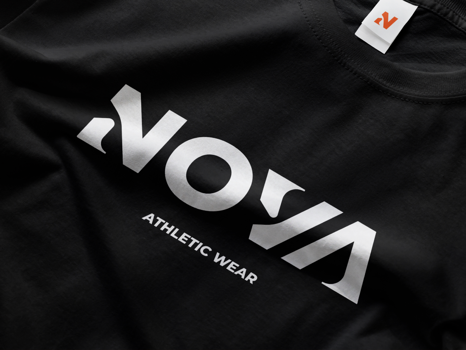
Athletic wear logo design focused on creating a bold, dynamic identity that communicates movement, strength, and performance. The visual direction emphasizes clean geometry and strong typography to ensure versatility across apparel, while maintaining a modern and energetic brand presence.

Challenges & Objectives

/ Challenges

Designing a logo that feels dynamic and energetic while remaining clean and highly versatile across different athletic applications. The identity needed to communicate movement and strength without relying on overly complex forms, ensuring it stays legible, scalable, and effective across apparel, embroidery, and digital use.

/ Objectives

To create a modern wordmark with custom lettering that resonates with a young, fitness-oriented audience, communicating energy, confidence, and contemporary athletic culture through a strong and distinctive typographic identity.

Athletic sports brand visual identity
Branding for athletic wear
Visual identity for atheltic sports brand
Logo design for athletic wear brand

Creative
process

The design began with exploring custom letterforms through sketching and typographic experimentation, focusing on rhythm, spacing, and motion within the wordmark. Different structural approaches were tested to balance boldness with clarity, gradually refining the forms into a cohesive system. The final direction was developed by simplifying and sharpening the lettering to enhance legibility while preserving a sense of energy and athletic movement.